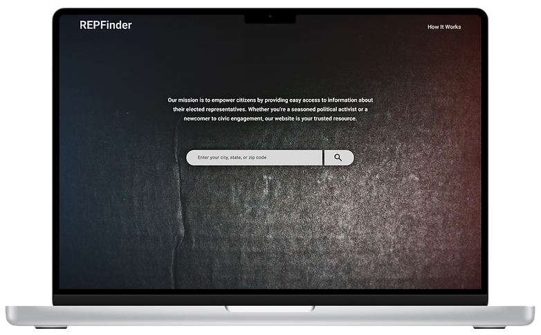
REPFinder Desktop site
Project Overview
Design a responsive website for users to find representatives
on both the state and federal levels.
Role
UX Designer
Responsibilities
Research, testing, wireframing, and prototyping
Duration
Approximately 2 months: November - December 2024


The problem:
There are numerous options to go to when researching political representation. Research found that some options were overwhelming or even difficult to navigate when searching for answers about who representatives are in the state and federal government.
The goal:
The goal of the REPFinder site is to present representative information to users in a clear way that enables them to get answers or the tools to stay informed and advocate for their community.
EMPATHIZE & DEFINE
Summary
Empathizing with and defining the needs of the user for the REPFinder site were a combination of tactics ranging from competitor audits, journey maps, and user research and more. Highlighted below are the Personas and Journey Maps.
Personas
Based on sample users, key user personas and bios were developed using AI as illustrated below, that would be utilized to determine the best resulting product for users.


Journey Maps
User persona data was then put to use in developing user journey maps. These were key to explore further the potential issues that users might have while navigating to find the answers they're seeking.


1
Accessibility
Conducting research online can be challenging for those with language barriers when coming across sites only formatted in English.
2
Too much content
Some users are overwhelmed by the large amount of content that they had to sift through to find their representative.
3
Navigation
In addition to vast amounts of content, research also brought to light how inefficient and unclear navigation was on certain sites.
From the user research the following were determined as potential pain points, and were used as drivers in the ideation phase to meet the users needs:
User pain points
IDEATION
User flow
As the ideation phase began the first step was to create the primary user flow. The user flow illustrates the path that a typical user might take to complete a task from start to finish.
The intent of this user flow is to show one option of how a user might search, locate, and determine the means by which to communicate with the state representative.
Additionally, other user flows are highlighted in the legend to demonstrate how a user can navigate through the site.

Digital wireframes
After the initial user research, and determining the user flow the next task was to jump into the ideation phase by generating rapid iterations of potential layouts and elements. These were digitally created on an iPad during this ideation session, while markings were placed next to elements that were deemed key to the needs of the user.


Lo-fi prototypes
Once the ideal layout is determined, the next task was creating low-fidelity mockups. These mockups contained no images, color, or final text and were used to determine if the layout and user flow was on point.
From the mockups a working lo-fi prototype was created that illustrated the user flow through the site. The image below illustrates this user flow in red, while also showing other options to navigate within the prototype.

Hi-fi prototype
After solidifying a direction for the layout and structure of the site, work started on the high-fidelity prototype. Graphics were added along with photos, links, and responsiveness. Placeholder text was created using AI as well as official representative contact information, moving the prototype to a closer representation of a production ready site.


Next steps
1
As mentioned earlier, this site will benefit from implementing a more keyboard friendly upgrade for navigation.
2
Final work on the responsiveness of the site across all platforms would be a big benefit for users.
3
Updating all of the representatives information would be a great step in finalizing this site.
Takeaways
Users in REPFinder's usability tests praised its intuitive navigation and clean visual design. Although the project is finished, these improvements would optimize it for production:
-
Keyboard accessibility upgrade.
-
Full responsiveness across multiple platforms.
-
Complete representative details and contact info.