Art Museum App and Desktop site
Project Overview
Design an app and a responsive website for a public art museum.
Role
UX Designer
Responsibilities
Research, testing, wireframing, and prototyping
Duration
Approximately 4 months: July - October 2024


The problem:
Based on user research life is hectic and can be challenging at times. Potential users are balancing stress, reading impairments, and language barriers, just to name a few. These possible conflicts result in many users missing out on new experiences.
The goal:
The Art Museum app will let users browse exhibitions, events, museum information and schedule visits with ease. This will allow busy patrons the flexibility to view current museum content and schedule visits, all from multiple devices.
EMPATHIZE & DEFINE
Summary
Initial user research for the Art Museum app was generally based on bios supplied through the course. From there they were expanded and developed with the assistance of AI into various tools to better empathize with the users.
Through the entire process, the following goals were referred to as guides in support of the user and the experience throughout:
-
Understand challenges users face when searching for events or activities online.
-
Identify frustrations users experience when trying to schedule and purchase tickets online.
Highlighted below are a few of the tools that were key in the next phase, ideation.
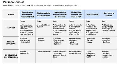
Personas were developed from bios to reflect further details about users that would be referenced repeatedly to drive the final product. Listed below are some of those details:
-
Education
-
Occupation
-
Goals
-
Frustrations
-
Problem Statement
-
Bio


Competitor research was done to examine the online presence of art museums regionally, and nationally, capturing feedback from both direct and indirect competitors.

User journey maps were compiled to illustrate a given task and the related steps, feelings, and opportunities for improvement. These data points along with other research methods would help to generate the following potential pain points.


User pain points
From the user research the following were determined as potential pain points:
1
Accessibility
Whether a language barrier, vision or other impairment, they can all be challenging when finding activities to do.
2
Big blocks of text
Large blocks of text or public engagement can be a struggle in the wrong situation for those with dyslexia or other challenges.
3
Navigation
Users struggle with navigation that makes it a challenge to find what they need, ranging from purchasing tickets to getting directions.
IDEATION
The ideation phase utilized progressive steps in building out the best layout required to meet the needs of the user. The following highlight the range of tools user to achieve the best product.
Sitemap
Initiating the ideation phase from a mobile-first approach, the sitemap was first developed to drive the user flow and navigation of the app.
User flow
The user flow was created to illustrate how a user might move through the app to browse events and exhibits, then purchase tickets.


Paper wireframes
Next in the ideation phase was generating rapid iterations of potential layouts and elements. After this ideation session, markings were placed next to elements that were deemed key to the needs of the user.

Lo-fi prototypes
When the ideal elements and layout were determined, the next task was creating low-fidelity mockups. These mockups contained no images, color, or final text and were instead primarily made up of shapes and lines in a grayscale color scheme. This allowed the focus to be on only necessary elements that are needed, and if the layout and user flow are as intended.

Hi-fi prototype
After developing the low-fidelity design, it was time to begin transforming it into the high-fidelity prototype as if it was being prepared for production. Along with the example of branding shown below, links, formatting, and realistic content were expanded in this effort.
Branding
Style was added, including colors, typeface, fonts, and imagery. With the help of AI, placeholder copy was created to add realistic content for the artist, exhibits, and events. All of these together brought the app closer to what would be sent to production.
Interations
As the design updates continued the following are examples of how it progressed with functional updates to improve the overall user experience.

Before
Newsletter sign up changed from a static element to a sticky button at the bottom of the screen on select pages. When clicked an overlay frame opens for users to sign up.

After
Before
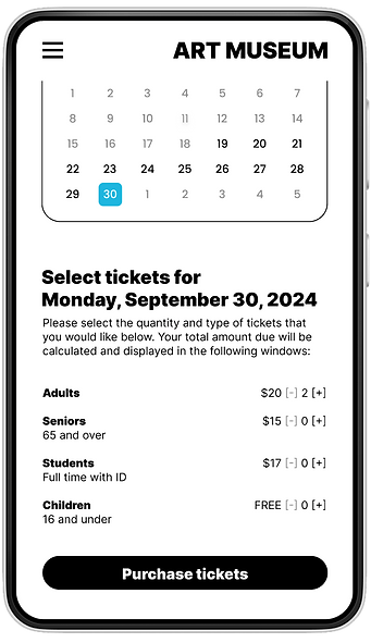
An 'order review' page and prompt were added as the user purchases tickets during checkout.

After

Desktop design
While utilizing the mobile first approach and finalizing the hifi-prototype, it was now time to translate the app to a desktop site.
The translation from mobile to desktop was straightforward for this project, with some elements such as the ticket selection and payment windows needing the most finessing upon completion.


Accessibility considerations
1
A high-contrast color scheme was selected to benefit those with certain vision impairments.
2
Changing icons and textures were used to assist those that might suffer from color blindness.
3
When produced, all images would have alternative text and be suitable for screen
reader use.
Takeaways
From a student's point of view, this was a big first project, and so much was learned from start to finish. It was very satisfying to see it all come together, but there are still items that could be addressed which are briefly mentioned below:
-
Add visual confirmation to subscription button upon email submission.
-
Implement fully functional calendar.
-
Populate Events and Exhibits with finalized content.